In the last article we covered how to get started with the chart controls. The article covered the basics of using the chart controls. In this article we are going to demonstrate how to draw 3D charts using Microsoft Chart Controls.
Recommended Reading:
If you are not familiar with Microsoft Charting Controls it is highly recommended that you read the following article:
We are going to have the same data source as in the previous article which is Exam. The BindData method populates the exam list with some dummy data as shown in the code below:
The code above populates the List<Exam> with some dummy exams and populates the chart control called ExamsChart. By default the chart control will render itself in 2D. In the next section we will focus on how to render chart in 3D.
Displaying 3D Chart on the Page:
You can easily convert a 2D chart into 3D by enabling the Enable3D property on the Area3DStyle element. The implementation is shown below:
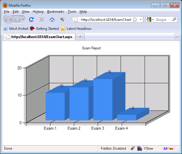
Run the application and you will get the following output:
One thing to notice is that even though we can see the labels on the x-axis which is the name of the exam we do not see anything on the y-axis which will indicate the points associated with the exam. It would be nice if on the top of each column chart we can see the associated score of the exam. In the next section we are going to demonstrate how to add custom markers on the top of the column chart.
Displaying Markers on the Chart:
The ChartSeries object contains the Label property which can be used to setup labels for the complete chart. We are only interested in labels associated with individual column chart. This is where the DataPoint class comes in handy. The DataPoint class contains the Label property which represents label associated with individual chart. In the code below we have added the Point value to the Label property of the DataPoint class.
When you run the above code you will see the following output:
As, you can see in the screenshot the chart is now clearly marked with the associated points. This conveys more information to the user and makes it easy for them to capture the essence of the rendered chart.
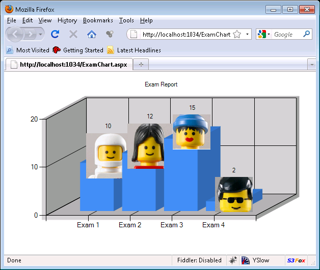
You can also use images as markers. This can be useful when you want to display a picture of the student who scored the highest points in the exam. Add a new property "PictureUrl" to the exam class and populate it with some dummy images. Use the following code to assign the MarkerImage property with the PictureUrl property on the exam object.
The result is shown below:
Conclusion:
In this article we learned how to create 3D charts using Microsoft chart controls. We also learned how to use markers and custom images to make 3D chart more informative and appealing.